In this blog I will show the steps I took to create an infographic analyzing New York City’s (NYC) street trees. My over arching question is Are dead street trees an alarming concern for NYC?
To answer this question I will be answering the following subset of questions:
What are the street trees health status?
What neighborhood requires the most street tree rehabilitation?
Are younger trees experiencing higher morality?
Data description
The data for this infographic was obtained from the NYC Department of Parks and Recreating OpenData. It contains street tree data recorded from their 2015 Street Tree Census citizen science project, TreesCount! Volunteers reported 666,134 trees with 45 variables.
The variables of interest were:
status: Indicates whether a tree is alive, standing dead, or a stump
health: Volunteer’s perception of tree health
tree_dbh: Diameter of tree measured at approximately 54 inches above the ground
Before delving into the data visualization code, it’s important to acknowledge the assumptions made during the statistical analysis. One major assumption is considering trees reported as ‘stumps’ as dead trees. Additionally, it’s assumed that volunteers were adequately trained in dendrology to identify tree species and determine their health status accurately. However, this reliance on volunteers introduces concerns about data quality, as subjective judgments may lead to errors. This is particularly evident when working with reported tree diameters (tree_dbh). For instance, the recorded diameter of the largest dead tree is 450 inches. As a long-term resident of NYC, I’ve never encountered a street tree to be comparably as large as a mature redwood. The NYC Parks and Recreating own highlights report of the census project states the largest street tree recorded that year was 87 inches. For the last question when working with street tree diameter I included them as a part of anything greater than 40 inches in diameter. There was only roughly 300 of trees reported in this matter but I still felt the need to include them as there is no way to test the accuracy without reaching out to the NYC Parks and Recreation.
Data Visualization
To answer my three questions I developed three visualizations.
I created two color palettes. One is for the treemap in my first question and the second is for the street tree frequency visualization.
Code
# Set color palette and fonttree_map <-c("Good"="#46a312","Fair"="#869F3B","Poor"="#CFBB59","Dead"="#6F4229")# Tree palettetree_palette <-c("dead"="#6F4229","alive"="#69cf6d","fill_grey"="grey95","title"="#66702D")# Add Alegreya fontfont_add_google(name ="Alegreya", family ="alegreya")
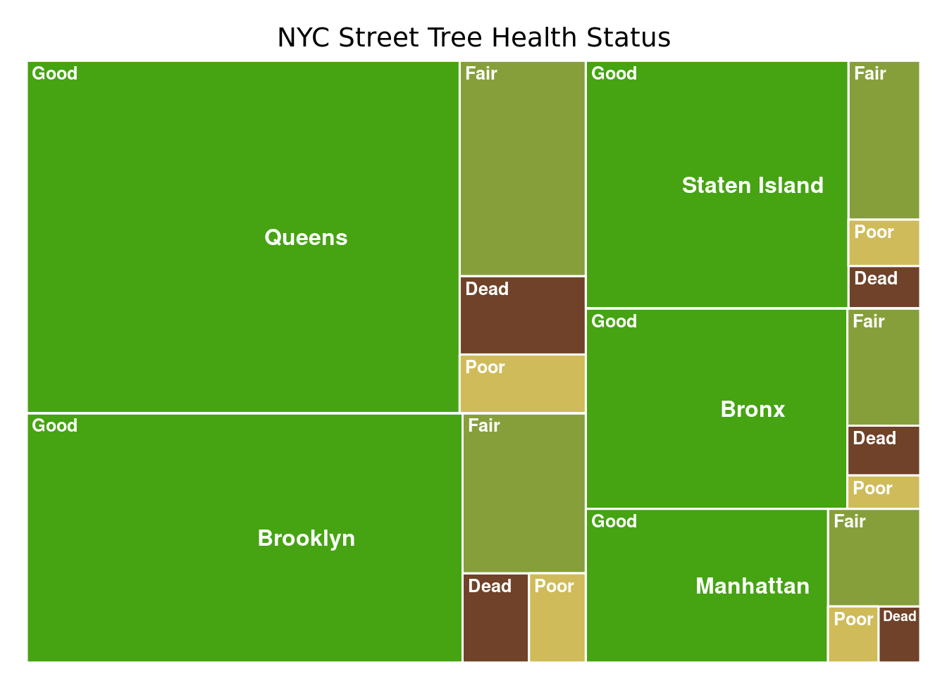
NYC Health Status Treemap
Since this dataset is about trees I had to use the treemap function for the first question. I was interested in getting an overall idea of the health status of the street trees across the 5 boroughs. The health status of the trees reported were subjective and based on the volunteers. They were categorized as good, fair, poor, and dead.
I first grouped them by borough and summarized the number of trees in each health category. The next step required me to rearrange the format of my dataframe to prep it for the treemap package.
Code
# First Visualization ----# Treemap# Prepare data for treemap formatbstatus <- nyc_trees %>%select(boroname, health) %>%group_by(health,boroname) %>%summarise(count =n()) %>%st_drop_geometry() %>%mutate(health =replace_na(health, "Dead")) %>%mutate(colors =ifelse(health %in%names(tree_map), tree_map[health],NA))# Treemap of NYC street tree health statustreemap(bstatus,index =c("boroname", "health"), vSize ="count",type ="color",vColor ="colors", fontsize.labels =c(12,9.5),labels =FALSE,bg.labels =0,border.col ="white",border.lwds =1.5,fontcolor.labels ="white",align.labels =list(c("center","center"),c("left","top")),force.print.labels =TRUE,title ="NYC Street Tree Health Status",fontfamily.title ="alegreya",fontface.labels ="bold" )
Additional edits to the treemap were done in Canva to add black borders over each borough.
Neighborhood with the most dead trees map
The first part of this visualization is determine what borough has the highest amount of dead trees.
Data Preparation
Code
# Borough dead and stump tree countboro <- nyc_trees %>%filter(status =="Dead"| status =="Stump") %>%group_by(boroname) %>%summarize(dead =n()) %>%st_drop_geometry()# Borough alive trees countboro1 <- nyc_trees %>%filter(status =="Alive") %>%group_by(boroname) %>%summarize(alive =n()) %>%st_drop_geometry()# Mergeboro_merge <-merge(boro, boro1)# Percent of dead trees# Bronx determined as having the highest percentageboro_merge <- boro_merge %>%mutate(ratio = dead/alive)gt(boro_merge %>%mutate("percent"=round(ratio *100 ,3)) %>%select(-ratio) %>%arrange(desc(percent))) %>%tab_header(title ="Percent of dead street trees across the 5 Boroughs, NYC")
Percent of dead street trees across the 5 Boroughs, NYC
boroname
dead
alive
percent
Bronx
4618
80585
5.731
Queens
12577
237974
5.285
Manhattan
2996
62427
4.799
Brooklyn
7549
169744
4.447
Staten Island
3875
101443
3.820
The Bronx is identified as the the borough with the highest percentage of dead tree. Then to further analyze I determined what neighborhood in the Bronx has the highest percentage of dead trees.
Code
### Neighborhood in the Bronx with highest amount of dead treebronx_neigh_dead <- nyc_trees %>%filter(boroname =="Bronx") %>%filter(status =="Dead"| status =="Stump") %>%filter(boroname =="Bronx") %>%group_by(nta_name) %>%summarise(dead =n()) %>%st_drop_geometry()# Count number of alive trees by neighborhood in the Bronxbronx_neigh_alive <- nyc_trees %>%filter(boroname =="Bronx") %>%filter(status =="Alive") %>%group_by(nta_name) %>%summarise(alive =n()) %>%st_drop_geometry()# Determine the percent of dead trees by neighborhoods# Bronxdale identified as the highest percentagebronx <-merge(bronx_neigh_dead, bronx_neigh_alive) %>%mutate(ratio = (round(dead/alive, 3))) %>%rename(ntaname = nta_name)gt(head(bronx %>%mutate("percent"=round(ratio*100,3)) %>%select(-ratio) %>%arrange(desc(percent)),5 )) %>%tab_header(title ="Top 5 Bronx Neighborhoods with the highest percent of dead street trees")
Top 5 Bronx Neighborhoods with the highest percent of dead street trees
ntaname
dead
alive
percent
Bronxdale
145
1405
10.3
Highbridge
182
1797
10.1
East Concourse-Concourse Village
213
2285
9.3
West Concourse
174
1968
8.8
Eastchester-Edenwald-Baychester
202
2427
8.3
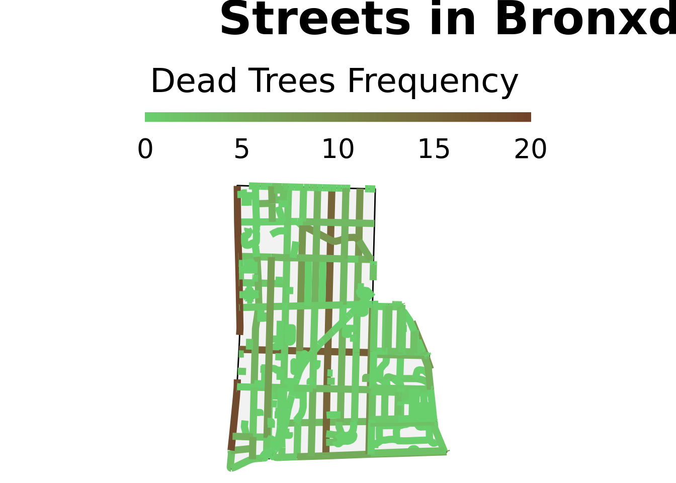
Bronxdale was identified as the neighborhood in the Bronx with the highest percent of dead trees.
Next I prepped the boundary for Bronxdale neighborhood.
Code
# BRONX boundarybronx_bounds <- nyc_boundary %>%filter(boro_name =="Bronx")# Check CRS#st_crs(bronx_bounds) == st_crs(nyc_trees)# Bronxdalebronxdale <- bronx_bounds %>%filter(ntaname =="Bronxdale")# Dead Trees in the Bronxbronx_dead <- nyc_trees %>%filter(boroname =="Bronx") %>%filter(status %in%c("Dead", "Stump"))# Remove neighborhood boundaries and have full Bronx shapebronx <-st_union(bronx_bounds)# Highlight were Bronxdale is locatedleaflet() %>%addTiles() %>%addProviderTiles(providers$CartoDB) %>%addPolygons(data = bronx, color ="black",fillColor =NA,opacity =0.8, weight =1) %>%addPolygons(data = bronxdale, color ="red")
I was able to calculate the frequency of dead street trees for each street by creating a buffer around the streets. Any tree that fell within that buffer was countes as a part of that street.
Code
## Load in Highways and roads in Bronxdale ----bush_roads_raw <-st_bbox(bronxdale) %>%opq() %>%add_osm_feature("highway") %>%osmdata_sf()bush_outline <- bronxdale %>%st_simplify() %>%st_union() %>%st_buffer(dist =0.001)bush_roads <- bush_roads_raw$osm_lines %>%st_transform(st_crs(bronxdale)) %>%st_crop(st_bbox(bronxdale)) %>%st_transform(3488) ## transform to meters
Warning: attribute variables are assumed to be spatially constant throughout
all geometries
Code
# CRS transforms ----bush_roads <-st_transform(bush_roads, crs =st_crs(bronxdale))bush_roads_buffer <- bush_roads %>%st_buffer(dist =20, endCapStyle ="FLAT")bush_roads_buffer <-st_transform(bush_roads_buffer, crs =st_crs(bronxdale))bronx_dead <-st_transform(bronx_dead, crs =st_crs(bronxdale))sf_roads_trees <- bush_roads %>%mutate(length =as.numeric(st_length(.)),tree_count =lengths(st_intersects(bush_roads_buffer, bronx_dead)) ) # Clip frequency of trees to Bronxdale bbbb <-st_intersection(bronxdale, sf_roads_trees)
Warning: attribute variables are assumed to be spatially constant throughout
all geometries
Code
# Zero streetszero_streets <- bbbb %>%filter(tree_count ==0)# Count of trees on streetstree_streets <- bbbb %>%filter(tree_count !=0)# Map of streetsp2<-ggplot() +geom_sf(data = bronxdale, lwd =0.5, color ="black", fill = tree_palette["fill_grey"]) +geom_sf(data = bbbb,aes(color = tree_count),lwd =2.5) +scale_color_gradient2(low ="white", mid = tree_palette["alive"],high = tree_palette["dead"], na.value =NA,name ="Dead Trees Frequency",breaks =c(0, 5, 10, 15, 20),limits =c(0,20)) +labs(title = stringr::str_wrap("Streets in Bronxdale, Bronx that require the most street tree rehabilitation")) +theme_void() +guides(color =guide_colorbar(barwidth =20, barheight =0.5, title.position ="top", title.hjust =0.3,ticks =FALSE)) +theme(plot.title =element_text(family ="alegreya", size =35, face ="bold",margin =margin(b=15)),legend.text =element_text(family ="alegreya",size =20),legend.title =element_text(family ="alegreya",size =25, hjust =0.8),plot.title.position ="plot",legend.position ="top") p2
Dead Trees Diameter Distribution
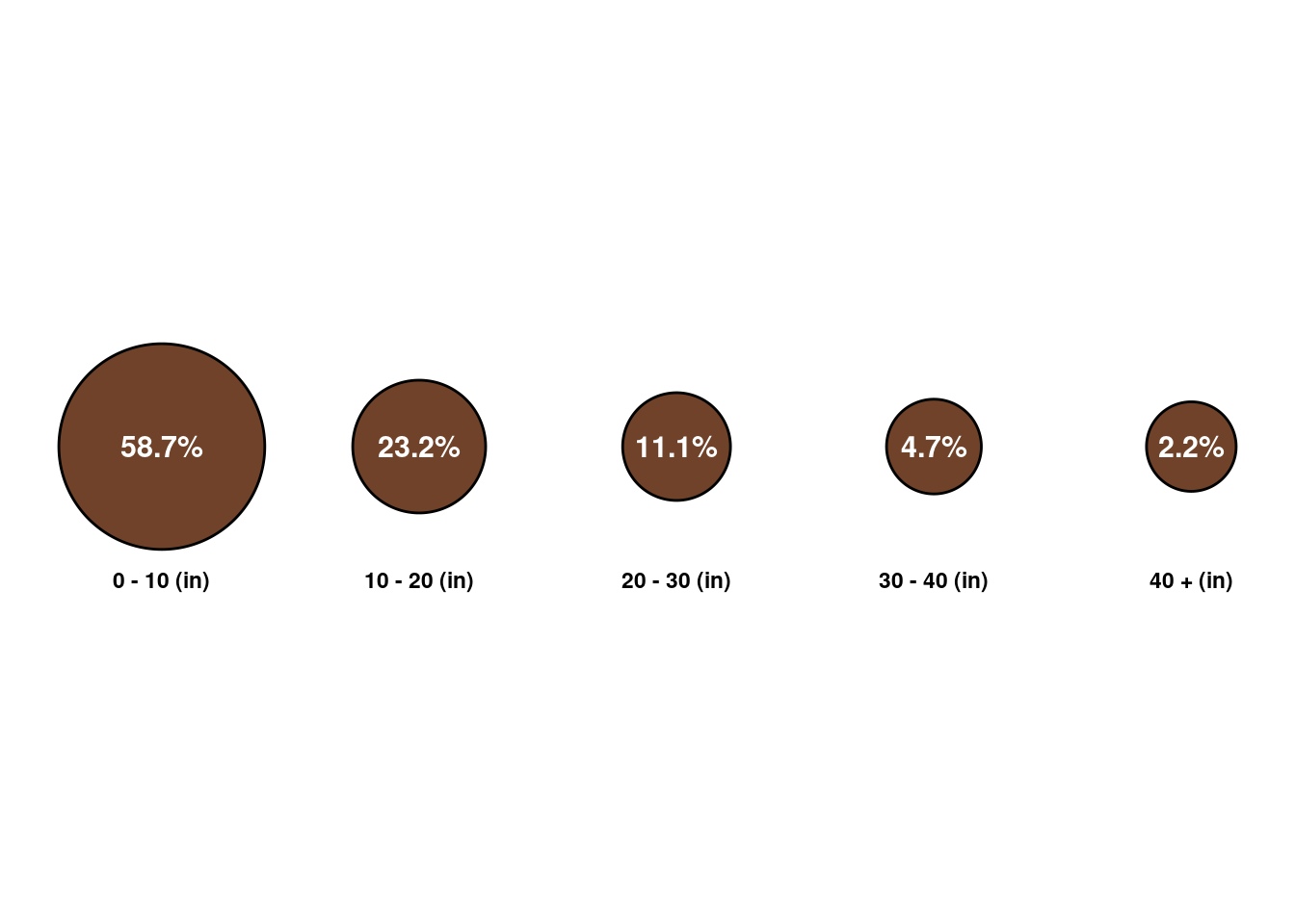
The third question was answered by developing a visualization of tree trunk diameter for all reported dead trees is NYC. I initially graphed the distribution as a histogram to get a general idea of the distribution of the diameter. It was heavily skewed to the left with a majority of reported diameters being less than 10 inches. My approach was to set diameter ranges and determine how many trees fell within each range and then calculated the percent of trees in each range. Starting from 10, I increase in increments of 10 up to 40 inches. The idea behind this visualization was to make circles relative to the percentage of trees in the range. I wanted them to be circular to represent tree stumps and then through Canva I overlayed a tree ring design to each circle.
Code
# Analyzing the distribution of trunk diameter of dead trees ---# Filter to Dead and Stump classified trees dead_trees <- nyc_trees %>%filter(status %in%c("Dead","Stump")) %>%select(status, tree_dbh, stump_diam)# Set diameter of tree in a new columnd <- dead_trees %>%mutate(diam =ifelse(tree_dbh ==0, stump_diam, tree_dbh))# Drop geometryd1 <- d %>%select(diam) %>%st_drop_geometry()# Set the breaks for the diameter rangesdiameters <- d1 %>%filter(!is.na(diam)) %>%mutate(range =cut(diam, breaks =c(0, 10, 20, 30, 40, Inf),labels =c("0 - 10 (in)", "10 - 20 (in)", "20 - 30 (in)", "30 - 40 (in)", "40 + (in)"),include.lowest =TRUE)) %>%group_by(range) %>%summarise(count =n()) %>%# determine percentage of dead trees in the selected rangesmutate(total =nrow(d1),percent = count/total) %>%mutate(r =10-(0.58706310- percent)*10) %>%# Set x and y positions for plottingmutate(x0 =seq(-60, 40, length.out =5),y0 =10)# Plottingp3 <-ggplot(data = diameters) +geom_circle(aes(x0 = x0, y0 = y0, r = r), fill = tree_palette["dead"]) +geom_text(aes(x = x0, y = y0, label = scales::percent(percent)),color ="white", size =4, fontface ="bold") +geom_text(aes(x = x0, y =-3, label = range), color ="black", size =3, fontface ="bold") +theme(text =element_text(family ="alegreya")) +theme_void() +coord_fixed()p3
Code
# Save plotggsave("plots/tree_diameter.png", bg ="transparent",width =15, height =10)
About 59% of the dead trees have a diameter between 0-10 inches. This is a bit concerning because this tells us younger trees are dying the most. They are not surviving past a certain age and this is something the NYC Parks and Recreation should consider investigating.
Design Elements
The design elements of this infographic were chosen carefully and took into consideration the following factors:
Text: The final graph, tree diameter, did not have a title coded in ggplot because I had difficulty getting it to align and be the right size. So I added the title for this graph in Canva. The captions and subtitles were also added through Canva as I found it difficult to align it how I would have liked in R.
Themes: I removed grid lines and grid boxes for all of my the plots to have a simple clean background. I added a beige color background to the final infographic to contrast the green and brown in my color theme.
Colors: I created two palettes and are in the first code chunk in this blog post. I wanted to stick to a tree color theme and my main colors are brown and green. I stuck to colors within that range when creating the treemap. I wanted the emphasis to be solely on the dead tree section and not the different boroughs. Therefore I added the black box as a way to visually group the data by boroughs.
Typography: For the text in the graph and infographic I used the font Alegreya, I though it was a nice font and it was one of the few I liked. I think it’s easy to read and understand and is not overly fancy or flamboyant. The text is Calibri Sans in the infographic.
General Design: The placement of my graphs in the visualization follow a see the big picture of all NYC trees and then zoom into a specific neighborhood. Then zoom back out to look at the diameter distribution. I also decided to add background information on how many trees and how the data was collected because I though it is what made the dataset unique. I also added text highlighting the major findings such as what was the total percent of dead trees. What borough saw the highest percent of dead trees and what was the value. This helped center and contextualize the data instead of just providing numbers.
Accessibility: I added alt text to all my figures for readers that are visually impaired. For my color choice I picked shades of green and brown that were easy to distinguish and are colorblind-friendly.
DEI lens: I think this is something I can further improve on now that I have identified what neighborhood has the highest percent of dead trees does this neighborhood have high population of low income? Can this be expressed across all neighborhoods does the median income relate to the number of dead trees?
.png)